

In a lengthy excerpt from his book Typeset in the Future: Typography and Design in Science Fiction Movies, Dave Addey speaks on the typography and design of Star Trek: The Motion Picture (and Trek in general).
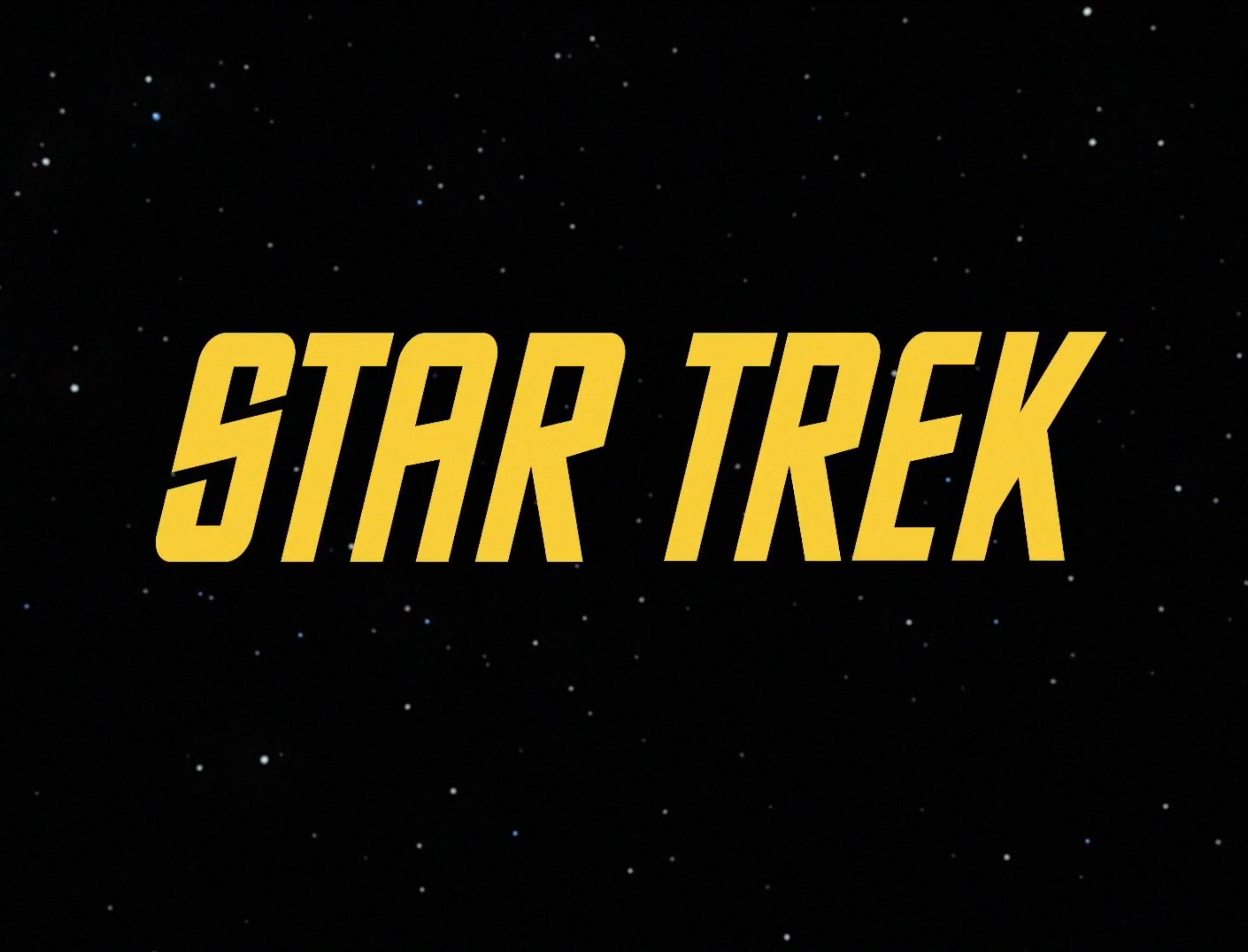
If you’re a fan of Star Trek: The Original Series, you might be expecting to see the font from its opening titles in Star Trek: The Motion Picture too. This font was (perhaps unsurprisingly) called Star Trek, though its modern-day digital version is known as Horizon, and is available only in non-italic form:
Read the rest of the article here…

Pingback: The over-the-top space fashions of the original Star Trek | s a m h o c h b e r g - m e t i c u l o u s l y r a n d o m i z e d