
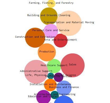
Fascinating Beeswarm/Moving Bubble chart at Flowing Data illustrating unemployment trends by occupation over the last year. Love these methods of data visualization.
Unemployment is still higher than usual, and as you probably know, the shutdowns nationwide have affected industries differently. We could look at unemployment for just this year, but it’s more useful to see what the rate was for last year and compare it to this year. This gives us a baseline to compare against.
